This is a Hero Title
This is a Hero text. We can include a link, a countdown, a form.
This is a Text Heading
This is the text aria for the Text module. We can position the module (including eyebrow, heading and text aria) to the left (like this Text module) or in the middle of the page (like the example below). We can include links like this one, or a Button.
We can select different color background for this module, including “Transparent” like this one, or a background picture. See below some examples.
This is a Text module
This background color is “Steel”.
This background color is “White”.
This background color is “Water”.
We can also use a background picture.
Side by side module
This is a side by side module. In this case, this left side is a Text content type. For a Text content type we can select a background color similar to what we have above (steel, air etc.)
On the right side we have a Fact box. This is predefined to have only 2 columns. We can insert multiple rows. The info we can include here is just text and (optionally) a link only under the second column on any row.
In any side by side module we have the option of choosing a content type we have on the left/ right side (no constraints): text, media, fact box, form.
We can setup a background color to the entire side by side module.
- some textsome textsome textsome textsome textsome other text
Another side by side module example
This module is having a left side Text with form content type, and a Media content type on the right side.
This lest side can have any background color from the ones on top.
Title
The media we can include here is an image/ a video or a storylane. In this case it’s an image.

This is an Editorial module
The info we can include here is: eyebrow, title, text + image cards with some text underneath it (including headline) and an optional link (see 2nd item).
We can setup a background color for the whole module.

1st editorial headline
Some description

3rd editorial headline
Some description

4th editorial headline
Some description
5th editorial headline
Some description
This is also an editorial
We can include more cards; we can select different background colors or gradients.
Headline 1
Lorem ipsum dolor sit amet, consectetur adipiscing elit, sed do eiusmod tempor incididunt ut labore et dolore magna aliqua. Ut enim ad minim veniam, quis nostrud exercitation ullamco laboris nisi ut aliquip ex ea commodo consequat.
Headline 2
Lorem ipsum dolor sit amet, consectetur adipiscing elit, sed do eiusmod tempor incididunt ut labore et dolore magna aliqua. Ut enim ad minim veniam, quis nostrud exercitation ullamco laboris nisi ut aliquip ex ea commodo consequat.
Headline 3
Lorem ipsum dolor sit amet, consectetur adipiscing elit, sed do eiusmod tempor incididunt ut labore et dolore magna aliqua. Ut enim ad minim veniam, quis nostrud exercitation ullamco laboris nisi ut aliquip ex ea commodo consequat.
This is an Editorial module used for speakers
The info we can include here is: eyebrow, title, text + image cards with some text underneath it (including headline) and an optional link.
We can setup a background color/ picture for the whole module.
Name
Some description goes here
Name
Some description goes here
This is another Editorial module used for speakers
The info we can include here is: eyebrow, title, text + image cards with some text underneath it (including headline) and an optional link.
We can setup a background color/ picture for the whole module.

Name
Some description goes here

Name
Some description goes here
Promo banner without form
Some text over the Banner. The text can be light or dark. We can use button(s).

Promo banner with form
Some text over the Banner. The text can be light or dark. We can use button(s). The form will be on the right side.

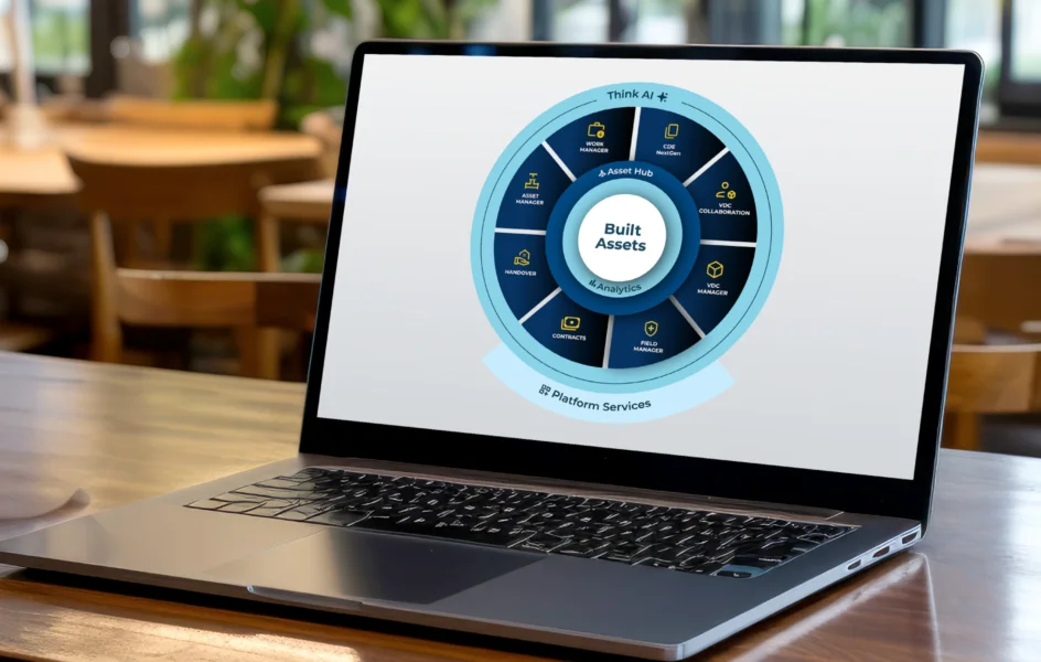
Image/video/storylane module
On this module we can include an eyebrow, heading, text; for all of them – left or center alignment. At this moment we can only have one picture/ video/ storylane. In the near future, we’re going to have a Gallery module as well.
We can apply a background color to the entire module.
This is an Accordion
In this module we can have an eyebrow, a heading, some text under the heading, accordion items titles and texts on the left side, and one or more picture(s)/ a video or a Storylane on the right side.
We can apply a background color to the entire module.
We may add multiple pictures on the right side of the accordion items.

“Lorem ipsum dolor sit amet, consectetur adipiscing elit, sed do eiusmod tempor incididunt ut labore et dolore magna aliqua. Ut enim ad minim veniam, quis nostrud exercitation ullamco laboris nisi ut aliquip ex ea commodo consequat. Duis aute irure dolor in reprehenderit in voluptate velit esse cillum dolore eu fugiat nulla pariatur. Excepteur sint occaecat cupidatat non proident, sunt in culpa qui officia deserunt mollit anim id est laborum.”
“Lorem ipsum dolor sit amet, consectetur adipiscing elit, sed do eiusmod tempor incididunt ut labore et dolore magna aliqua. Ut enim ad minim veniam, quis nostrud exercitation ullamco laboris nisi ut aliquip ex ea commodo consequat. Duis aute irure dolor in reprehenderit in voluptate velit esse cillum dolore eu fugiat nulla pariatur. Excepteur sint occaecat cupidatat non proident, sunt in culpa qui officia deserunt mollit anim id est laborum.”
“Lorem ipsum dolor sit amet, consectetur adipiscing elit, sed do eiusmod tempor incididunt ut labore et dolore magna aliqua. Ut enim ad minim veniam, quis nostrud exercitation ullamco laboris nisi ut aliquip ex ea commodo consequat. Duis aute irure dolor in reprehenderit in voluptate velit esse cillum dolore eu fugiat nulla pariatur. Excepteur sint occaecat cupidatat non proident, sunt in culpa qui officia deserunt mollit anim id est laborum.”
This is a tab module
We can align the content to the left or in the center.
Tabs can include: only text/ statistics (see 1st tab for an example)/ side by side modules(see 2nd tab).
This tab module is highlighted (steel color background on this text and tabs), but we have the option to not do this – see this link for a reference– look for Thinkproject x TenneT
We can apply a background color to the entire module.
Text header
For statistics we can have multiple columns. For each column, we can insert text on free rows.
1234+
Header
Description
12%
Header
Description
Text header
For statistics we can have multiple columns. For each column, we can insert text on free rows.
1234+
Header
Description
12%
Header
Description
side by side header
“Lorem ipsum dolor sit amet, consectetur adipiscing elit, sed do eiusmod tempor incididunt ut labore et dolore magna aliqua. Ut enim ad minim veniam, quis nostrud exercitation ullamco laboris nisi ut aliquip ex ea commodo consequat. Duis aute irure dolor in reprehenderit in voluptate velit esse cillum dolore eu fugiat nulla pariatur. Excepteur sint occaecat cupidatat non proident, sunt in culpa qui officia deserunt mollit anim id est laborum.”
This is a testimonial module
We can apply a background color to the entire module.
 An eyebrow"Here we can include some text.Lorem ipsum dolor sit amet, consectetuer adipiscing elit. Aenean commodo ligula eget dolor. Aenean massa. Cum sociis natoque penatibus et magnis dis parturient montes, nascetur ridiculus mus. Donec quam felis, ultricies nec, pellentesque eu, pretium quis, sem. Nulla consequat massa quis enim. "Name or something elseCompany name or something else
Here is the Statistics module
This is similar to the statistics from the Tab module above.
We can apply a background color to the entire module.
465$
a header
some description on this
12+
another header
some description on this
1300%
another header
some description on this
This is a Table module
We can have a max of 5 columns/ table. We can choose a different background color for each cell.
We may include pictures inside cells as well.
We can apply a background color to the entire module.
Column header 1 | Column header 2 | Column header 3 | Column header 4 | Column header 5 |
|---|---|---|---|---|
Row 1 | Row 2 |  | Row 4 | Row 5 |
This is a FAQ section
some text here
some text here
some text here
some text here
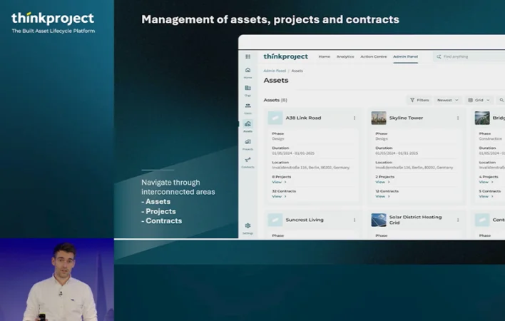
This is a Dynamic Content module
Here we can preview a post type (insights/ assets/ news/ partners) and some Taxonomy specificity for every post type.
We can apply a background color to the entire module.
-
Whitepaper
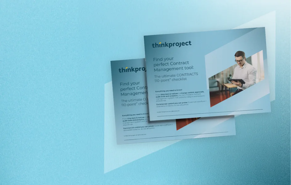
Contracts
Top 110 Question for CONTRACTS
Download your exclusive guideBuilt to help Commercial and Procurement leaders assess governance, audit trail, evidence capture, programme oversight, integrations, and security ideal for RFPs and vendor comparisons.
-
Demo videos
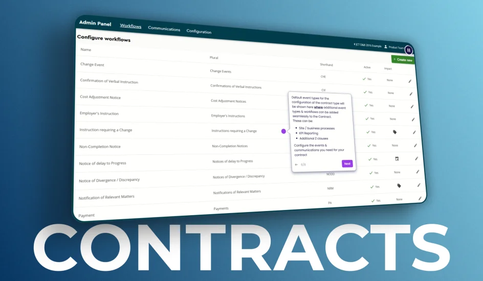
Contracts
JCT Contract Governance in Action
Watch the JCT DemoWatch a guided demo of Thinkproject CONTRACTS for JCT. See how governed workflows, audit trails, and evidence capture reduce risk and protect entitlement at programme scale.
-
Blog
Built Asset Lifecycle Platform
From fragmented tools to a shared operating platform: introducing Thinkproject Platform 2026
Read moreExplore how the Thinkproject Platform unifies data, workflows, contracts and assets across the built asset lifecycle.
-
Event
Built Asset Lifecycle Platform
Thinkproject Live London 2026
Register nowDiscover how AI and connected data are helping teams reduce risk, improve control, and make faster, smarter decisions across the project lifecycle.
-
Blog

Inside Thinkproject
Building for good: why Thinkproject is partnering with CRASH
Read moreThinkproject partners with CRASH charity to support homelessness and hospice organisations, strengthening its ESG commitment in the built environment.
-
Webinar

Built Asset Lifecycle Platform
Thinkproject Platform 2026 Launch Event
Register todayWatch the launch event recording, where we’re unveiling the Thinkproject Platform 2026 - a major step forward, bringing together powerful new products, advanced agentic AI and AI-powered search capabilities, along with a new generation of platform services and integrations.
-
Blog
Digitalization
Digital transformation in construction: 2026 trends
Read moreDiscover the top 6 digital transformation in construction trends for 2026, from AI and BIM to digital twins and connected job sites.
-
Demo videos
Built Asset Lifecycle Platform
Thinkproject Demo: Platform Overview & Built Asset Lifecycle
Watch demo videoWatch this demo to explore the platform overview, built asset lifecycle tools, BIM collaboration, CDE workflows and performance insights.
-
Event
Built Asset Lifecycle Platform
Thinkproject Live Events 2025
Read moreDiscover how a connected data ecosystem drives smarter decisions, greater efficiency, and unlocks AI-powered innovation across the asset lifecycle.